W&L’s MyApps single sign-on service, powered by Okta, is getting a redesigned user-interface (UI). ITS will be rolling out the “new look” to the community on July 29th. The upgraded dashboard will be easier to navigate, more mobile friendly, and loads 50% faster than the current version.
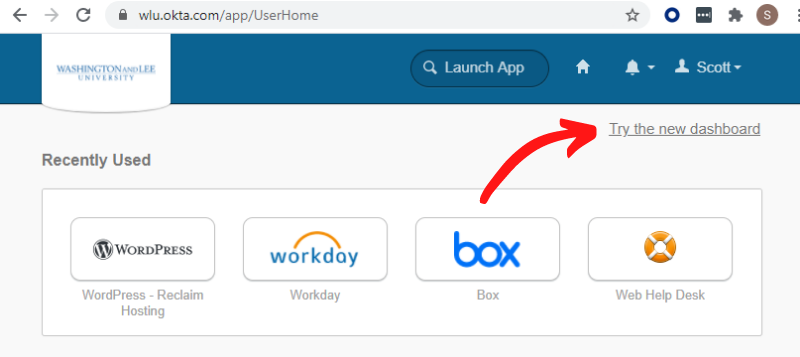
The best part is that you don’t have to wait until July 29th to take the new MyApps for a test drive. Starting on July 12th, you will have the option to “Try the new dashboard”. Simply click the link as shown below. To switch back, click your name, then “Back to the old dashboard”.
The Upgrade Includes the Following New Features
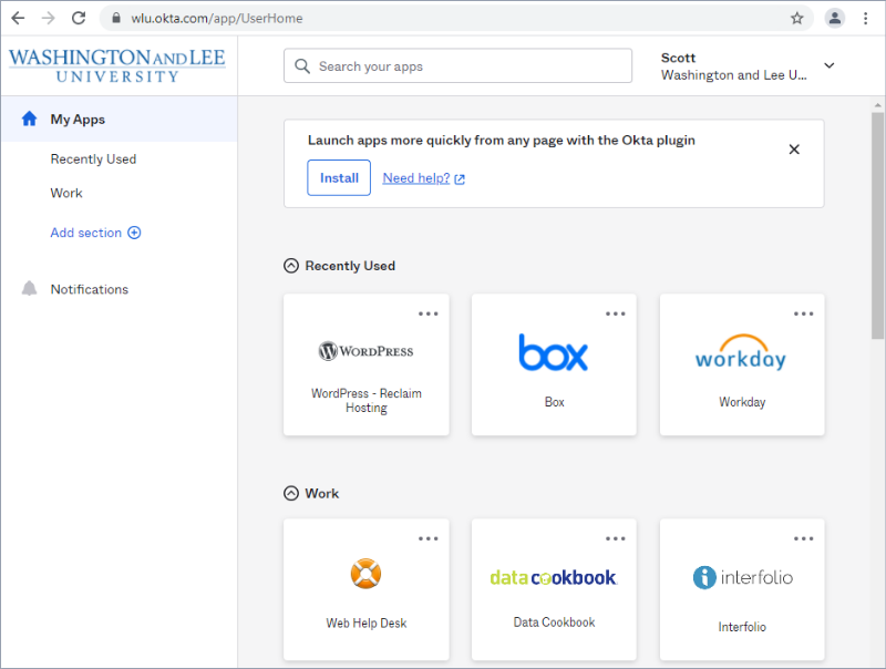
New side navigation design
The redesign starts with a new side-navigation panel, which sets the foundation for a more scalable and versatile design, better aligned with other modern enterprise apps that you’re probably familiar with.
Updated app cards
Often referred to as “chiclets”, the app cards represent the various applications that a user has access to. The cards are larger with more information within each card to make them more useful. Everything related to the application is contained within the card, so it’s easy to find and work with. Just like the old design, you can still drag and drop the cards to customize the look of your Dashboard.
Search is now fuzzy
If you choose to use search to locate the application you need, the algorithm is now more forgiving. Suggestions are provided, even if you don’t enter the exact app name.
Sections are the new tabs
Previously, tabs were used to organize and group cards. They’ve been reimagined as “sections”, which better fits into the single-page Dashboard view. You can create customized sections such as “Personal” or “Favorites” and move cards into those sections for easier navigation.
If you have any questions about the MyApps upgrade, please contact the ITS Helpdesk at 458-HELP or help@wlu.edu.